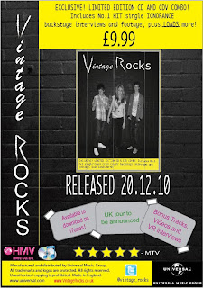
Final Magazine Advertisement
This is the final magazine advertisement for promoting our band. We have considered all of the changes which were asked throughout our other drafts in order to create this as our final. These drafts and the process we took in creating the ideas and final product are shown under the image below.

Purposes and conventions of magazine advertisements
Magazine advertisements are used so that institutions can show their products to their target audiences. Institutions create magazine advertisements to get their brand recognised within the consumer market. Magazine advertisements are created to play on a need or insecurity of the audience. Abraham Maslow created a hierarchy of needs which shows different human needs. These can be applied to magazine advertising, showing that the product being sold will help to fill those needs. Advertisements can also be used to show how an institution has created a product to differentiate themselves from other products of the same kind
These are the current codes and conventions for a magazine advertisement which we are going to use to create our music band magazine advertisement with. These are all the right codes and conventions that the audience would see if they was to purchase a digipack. As a group we will constantly refer to this list to make sure all the codes and conventions are included in our music band magazine advertisement. They go as follows:
- Images
- Variety of colours and fonts,House style
- Positioning of images and text in the top third where the eye is typically drawn to first
- Title of the product
- Where and how to buy the product
- Websites for the product and institution
- An organised layout – not too crowded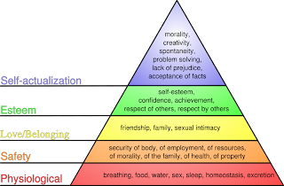
- A lure or need
- Title of the product
- Where and how to buy the product
- Websites for the product and institution
- An organised layout – not too crowded

- A lure or need
- Image, usually celebrity or good looking person selling the product
- Image of the product
- Ratings, quotes
- Ratings, quotes
- Classification sticker, parental advidory
- Positive language
Other typical conventions of CD/DVD advertisements are:
- Images of artists
- Tour dates
- CD release date
- Bonus features - showing the audience are getting more for their money
- Pictures of content
- Quotes or ratings from well known institutions
We aim to use all of the typical conventions of amagazine advertisement in our own advertisements to help attract our target audience.
A magzines purpose isto persuade the audience they will become happier and improve their quality of life. Magazine advertising is set out for brand recognission and to promote your product, in this case our band. Magazines play on the audience's needs and desires the product is supposedly there to fufill these.

This magazine advertisement plays on social acceptance and beauty. This product is supposed to make the audience believe that if they have this product they will be beautiful which is a main priority in society today. This is an example of interpellation as it creates a false image of how we should be which is not obtainable.
Analysing Magazine Advertisements- From Our Genre Pop/Rock
 These three magazine advertisement are from our chosen genre which is pop/rock music. We are analysing these advertisements, keeping in mind with the four key concepts and conventions of pop rock music. By analysing these three examples of advertisements from our intended genre, we will have more ideas to make our magazine advertisement appeal.
Annotations appear all around the magazine advertisement with areas that connect with the four key concepts plus the codes and coventions for this music genre. This inlcudes red bold lettering emphasising the title, ' Language. Sex. Violence. Other?' alsothis is symbolises the colour of blood implying violence will happen. Dark background with contrasting red lettering is a convention of rock music as dark background is relating to the mood and denotation behind the music lyrics. The live performance phoographs appear alongside the photo of a mans head being pulled out of water, this relates to the liveliness and dare devil attitude rock artists have.
Foo Fighters CD/DVD Advert
Below is another example of a magazine advertisement for a CD/DVD in our genre. We will use this advertisement and analysis to help decide on what to do for our own magazine advert for Vintage Rocks.


This is one of the magazine
adverts I analysed in order to get ideas before creating our final one. The colour scheme is black and white - genre specific and is also continued throughout the different sections of information. The red also links to the genre as it is typically used, it is also used for the band's name, this causes it to stand out and seperates it from the rest of the text. Plus, it is in the top third, typically where the eye goes f
irst. This is one of the main conventions of a magazine advert.
There is also a quote
from a popular magazine, for brand recognition. This will persuade the audience to believe they are a popular and successful band and encourage them to buy the product.
The main singer is also closer to the camera causing the audience to focus on him more as he is lead. They are also dressed formally, this seperates them from other bands within their genre, appealing to their audience and showing creativity.
The image is large and takes up the majority of the page, this is also the front cover of their CD, making it easier for the audience to recognise the product when they see it in a shop.
The release date is also placed upon this advert in quite a large font helping the audience to clearly see this.
Research in to magazines
We researched in to a number of magazines, to decide which magazines would
be appropriate to place our advertisement to promote our digipack. As our band is part of the hybrid genre pop-rock, we decided that we would target magazines such as ‘Kerrang’ and ‘NME’. These two magazines promote artists and music which usually fall under the rock genre. These two magazines are also mainly targeted at males; therefore this would help our advertisement reach the males in our target audience. To target the females within our audience, we would place our advertisement in ‘Closer’ and ‘More’ magazine. Even though these are not typical music magazines, they do tend to advertise pop music. Therefore we are targeting the pop side of our genre by placing the advertisements here. Below sh
ows examples of these magazines:


Magazine Advertisement Mock-Ups ( 1st Drafts)


Magazine Advertisement Mock-Ups ( 1st Drafts)

This is one of the four drafts we did before finalising the magazine advert. I included the codes and conventions of a magazine advertisement:
- Persuasive language
- Image of the album cover
- Promotional shot of main singer - sex appeal
- Title of band
- Clear layout, easy to understand
-Links to other medias - website
This draft will be discussed within our group and
some of the features will be carried out in our fin
al design as they are key conventions that need to be used.


This is one of the three first drafts for our bands music magazine advertisement. These three first drafts will be analysed by our group to see how they hav
e come up against the codes and conventions of a magazine advertisement(above). This will allow us a group to decide the parts of the three drafts we can use to produce a final draft of the advertisement ready to create. By analysing the three drafts and picking out aspects of the three drafts to make a final draft, this will push us on furt
her to achieving the four key concepts. Most importantly the codes and conventions included in the advertisement to have the best chance to reach the maximum target audience.
The first draft advertisement (left) shows the title appearing on the left hand side which is unusual and unconvental for typical magazine advertisements as the title would appear in the top third. The reason for this is to think creatively and appearing a
t the top is ' out in stores 28.10.10', this will attract the audience to look at the advert because
they will want to see what is coming out on that particular date. Quotes and ratings from established and an iconic and succes
sful artist such as ' Bon Jovi' appear underneath the release date. This is to let the audience know that this band must be promising and talented for the likes of 'Bon Jovi' to quote on their album. The price is shown alongside the ratings which stands out above the cd attracting the audience to the fac
t its a reasonable priced digipack and the audience is definitely getting their quality for the moneys worth. This price is also affordable for the target audience. Below the price is the product itself, which is in the centre of the advertisement to create awareness that this is the product the audience should be looking out for in stores coming 28.10.10. On the digipack is the special features promotional sticker besides the main image of the three artists in 'Vintage Rocks'. Below the product shows the sticker/ pin
up board style look which include the content of the digipack. For instance ' UNSEEN FOOTAGE' and NUMBER ONE HIT 'IGNORANCE''. This style fits perfectly well with the conventions of the pop/rock genre.
 To the left is the second draft of a magazine advertisement. We have annotated the connotations to show why we decided on the decisions
we have made. We have used many of the typical codes and conventions when creating this to make sure it looks like a typical magazine advertisement. Although some of the annotations have been made on the mock up, there are more listed below:
- Representation - The image of the band on the front cover represents them as bei
- Representation - The image of the band on the front cover represents them as bei
ng a mixed gender band. Amie is in the middle, wearing a cropped top. This shows the theory of sex appeal, as male members of the audience will find her attractive. This is also the theory of male gaze. We have used her as the main focus of the image, she could be cast as an 'object.' The male members of the band will also appeal to female audience members.
Also for representation, we have chosen, in this mock up, to not show a big image of the band but to show them on the from cover of the product. This shows that the music is more important than the band's image. This links to previous research in to genre, which showed most rock acts focus mainly on music and not image, a
Also for representation, we have chosen, in this mock up, to not show a big image of the band but to show them on the from cover of the product. This shows that the music is more important than the band's image. This links to previous research in to genre, which showed most rock acts focus mainly on music and not image, a
s opposed to pop acts.
- Institution - The instituton is shown o
- Institution - The instituton is shown o
n the advertisement as the record label's logo is shown at the bottom of the advertisement. We have positioned it here on all the mock up ideas as during research, this is where it is typically shown on a magazine advertisement.
- Codes and Conventions - This mock up magazine advertisemtns uses all the key conventions of a typical advertisement. These include conventions such as image, product name, where to buy the product from, release date and many more.
- Codes and Conventions - This mock up magazine advertisemtns uses all the key conventions of a typical advertisement. These include conventions such as image, product name, where to buy the product from, release date and many more.
Magazine Theories
We researched a number of different media theories and chose the ones that could appeal to our band magazine advertisement. We also found examples in order to make it is easier for us to understand when creating our own.
Use of Repetition:
The repetition of a word or image to persuade the audience and empthasise something. For example on a Digipak cover the repetition of the word
s 'Bonus', 'Exclusive' and 'Unseen' causes the audience to feel as if they are getting more for their money and it is only possible to see the footage/images if they were to buy the Digipak and not the regular single or album.

'What is beautiful is good'
This theory connects to the audience on a self confidence level, basically implying that the product the audience sees is beautiful, will show that it will benefit the consumer/audience. Linking to the practical production, we will use good looking and use sexually attractive people to attract the audience, linking with sex appeal to show that the beautiful and sexy
band members could encourage the audience to take up their current clothing or lifestyle.
2 - Sex Appeal
This theory is used to attract an audience to a product. Many institutions use an image to promote their product which could be seen to use sex appeal. For example they would place an image of a woman/man as the main focus which could be seen as pretty/sexy to the other gender. This attracts the audience as they would either want to look like the person themselves or want their partner to look like them. The audience believe that by buying the product they can obtain this. However typically, this is unobtainable,
as the audience are influenced to create a false image of themselves. This is called interpellation. 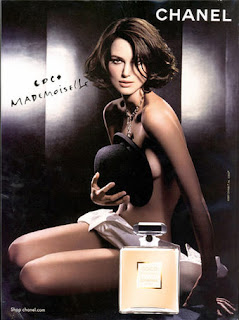 An example of this is shown below.
Magazine advertisement first draft
Below is a print screen for our first draft of our magazine advertisement for our digipack. After looking at it again, we have discovered some elements need changing or rearranging. The list of changes needed are shown next to the printscreen.

- Institutional logo needs to be placed at the bottom of the ad
 An example of this is shown below.
Magazine advertisement first draft
Below is a print screen for our first draft of our magazine advertisement for our digipack. After looking at it again, we have discovered some elements need changing or rearranging. The list of changes needed are shown next to the printscreen.

- Institutional logo needs to be placed at the bottom of the ad
vertisement.
- Add in release date and price so the audience known when and how much the product is available.
- Decide which information needs to be seen first, what is most important and will attract the target audience.
- Add the 'VR' logo to the cover, making it link back to the other texts.
- Keep to the house style created through the other texts.
Magazine Advertisement Second Draft
Below is a print screen of our second draft of the magazine advertisement. After revising the targets we set ourself from the first draft, we produced the following image as our second draft. However, we have since discovered more aspects which we want to change to improve it. They are shown below the image of our second draft:

- Change the colour and font of the boxes at the bottom, so that they link to the other texts
- Change the central image of the digipack cover as it is blurred slightly
- Remove the " marks from around the title of the single
- Add the price so that the audience know how much they can buy it for
Magazine Advertisement Third Draft
Below is a screen shot of the third draft of our magazine advertisement. I used the comments on elements which needed improving from the second draft and applied them to this draft. We added a price to the advertisement so that the target audience can see straight away how much the product costs. We also changed the colour of the posters so that they link to the digipack cover, showing a clear housestyle throughout.
No comments:
Post a Comment
Note: only a member of this blog may post a comment.