Wednesday, 29 September 2010

Magazine Advertisements

Final Magazine Advertisement

This is the final magazine advertisement for promoting our band. We have considered all of the changes which were asked throughout our other drafts in order to create this as our final. These drafts and the process we took in creating the ideas and final product are shown under the image below.


Purposes and conventions of magazine advertisements
Magazine advertisements are used so that institutions can show their products to their target audiences. Institutions create magazine advertisements to get their brand recognised within the consumer market. Magazine advertisements are created to play on a need or insecurity of the audience. Abraham Maslow created a hierarchy of needs which shows different human needs. These can be applied to magazine advertising, showing that the product being sold will help to fill those needs. Advertisements can also be used to show how an institution has created a product to differentiate themselves from other products of the same kind


These are the current codes and conventions for a magazine advertisement which we are going to use to create our music band magazine advertisement with. These are all the right codes and conventions that the audience would see if they was to purchase a digipack. As a group we will constantly refer to this list to make sure all the codes and conventions are included in our music band magazine advertisement. They go as follows:


- Images
- Variety of colours and fonts,
House style


- Positioning of images and text in the top third where the eye is typically drawn to first
- Title of the product
- Where and how to buy the product
- Websites for the product and institution
- An organised layout – not too crowded
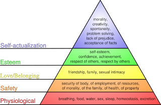
- A lure or need


- Image, usually celebrity or good looking person selling the product


- Image of the product
- Ratings, quotes


- Classification sticker, parental advidory


- Positive language


Other typical conventions of CD/DVD advertisements are:
- Images of artists
- Tour dates
- CD release date
- Bonus features - showing the audience are getting more for their money
- Pictures of content
- Quotes or ratings from well known institutions

We aim to use all of the typical conventions of a
magazine advertisement in our own advertisements to help attract our target audience.

A magzines purpose isto persuade the audience they will become happier and improve their quality of life. Magazine advertising is set out for brand recognission and to promote your product, in this case our band. Magazines play on the audience's needs and desires the product is supposedly there to fufill these.


This magazine advertisement plays on social acceptance and beauty. This product is supposed to make the audience believe that if they have this product they will be beautiful which is a main priority in society today. This is an example of interpellation as it creates a false image of how we should be which is not obtainable.


Analysing Magazine Advertisements- From Our Genre Pop/Rock


These three magazine advertisement are from our chosen genre which is pop/rock music. We are analysing these advertisements, keeping in mind with the four key concepts and conventions of pop rock music. By analysing these three examples of advertisements from our intended genre, we will have more ideas to make our magazine advertisement appeal.


Annotations appear all around the magazine advertisement with areas that connect with the four key concepts plus the codes and coventions for this music genre. This inlcudes red bold lettering emphasising the title, ' Language. Sex. Violence. Other?' alsothis is symbolises the colour of blood implying violence will happen. Dark background with contrasting red lettering is a convention of rock music as dark background is relating to the mood and denotation behind the music lyrics. The live performance phoographs appear alongside the photo of a mans head being pulled out of water, this relates to the liveliness and dare devil attitude rock artists have.


Foo Fighters CD/DVD Advert


Below is another example of a magazine advertisement for a CD/DVD in our genre. We will use this advertisement and analysis to help decide on what to do for our own magazine advert for Vintage Rocks.


This is one of the magazine
adverts I analysed in order to get ideas before creating our final one. The colour scheme is black and white - genre specific and is also continued throughout the different sections of information. The red also links to the genre as it is typically used, it is also used for the band's name, this causes it to stand out and seperates it from the rest of the text. Plus, it is in the top third, typically where the eye goes f


irst. This is one of the main conventions of a magazine advert.


There is also a quote
from a popular magazine, for brand recognition. This will persuade the audience to believe they are a popular and successful band and encourage them to buy the product.


The main singer is also closer to the camera causing the audience to focus on him more as he is lead. They are also dressed formally, this seperates them from other bands within their genre, appealing to their audience and showing creativity.


The image is large and takes up the majority of the page, this is also the front cover of their CD, making it easier for the audience to recognise the product when they see it in a shop.


The release date is also placed upon this advert in quite a large font helping the audience to clearly see this.


Research in to magazines
We researched in to a number of magazines, to decide which magazines would
be appropriate to place our advertisement to promote our digipack. As our band is part of the hybrid genre pop-rock, we decided that we would target magazines such as ‘Kerrang’ and ‘NME’. These two magazines promote artists and music which usually fall under the rock genre. These two magazines are also mainly targeted at males; therefore this would help our advertisement reach the males in our target audience. To target the females within our audience, we would place our advertisement in ‘Closer’ and ‘More’ magazine. Even though these are not typical music magazines, they do tend to advertise pop music. Therefore we are targeting the pop side of our genre by placing the advertisements here. Below sh
ows examples of these magazines:


Magazine Advertisement Mock-Ups ( 1st Drafts)


This is one of the four drafts we did before finalising the magazine advert. I included the codes and conventions of a magazine advertisement:


- Persuasive language


- Image of the album cover


- Promotional shot of main singer - sex appeal


- Title of band


- Clear layout, easy to understand


-Links to other medias - website


This draft will be discussed within our group and


some of the features will be carried out in our fin


al design as they are key conventions that need to be used.


This is one of the three first drafts for our bands music magazine advertisement. These three first drafts will be analysed by our group to see how they hav


e come up against the codes and conventions of a magazine advertisement(above). This will allow us a group to decide the parts of the three drafts we can use to produce a final draft of the advertisement ready to create. By analysing the three drafts and picking out aspects of the three drafts to make a final draft, this will push us on furt


her to achieving the four key concepts. Most importantly the codes and conventions included in the advertisement to have the best chance to reach the maximum target audience.


The first draft advertisement (left) shows the title appearing on the left hand side which is unusual and unconvental for typical magazine advertisements as the title would appear in the top third. The reason for this is to think creatively and appearing a
t the top is ' out in stores 28.10.10', this will attract the audience to look at the advert because


they will want to see what is coming out on that particular date. Quotes and ratings from established and an iconic and succes
sful artist such as ' Bon Jovi' appear underneath the release date. This is to let the audience know that this band must be promising and talented for the likes of 'Bon Jovi' to quote on their album. The price is shown alongside the ratings which stands out above the cd attracting the audience to the fac


t its a reasonable priced digipack and the audience is definitely getting their quality for the moneys worth. This price is also affordable for the target audience. Below the price is the product itself, which is in the centre of the advertisement to create awareness that this is the product the audience should be looking out for in stores coming 28.10.10. On the digipack is the special features promotional sticker besides the main image of the three artists in 'Vintage Rocks'. Below the product shows the sticker/ pin


up board style look which include the content of the digipack. For instance ' UNSEEN FOOTAGE' and NUMBER ONE HIT 'IGNORANCE''. This style fits perfectly well with the conventions of the pop/rock genre.


To the left is the second draft of a magazine advertisement. We have annotated the connotations to show why we decided on the decisions


we have made. We have used many of the typical codes and conventions when creating this to make sure it looks like a typical magazine advertisement. Although some of the annotations have been made on the mock up, there are more listed below:
- Representation - The image of the band on the front cover represents them as bei


ng a mixed gender band. Amie is in the middle, wearing a cropped top. This shows the theory of sex appeal, as male members of the audience will find her attractive. This is also the theory of male gaze. We have used her as the main focus of the image, she could be cast as an 'object.' The male members of the band will also appeal to female audience members.
Also for representation, we have chosen, in this mock up, to not show a big image of the band but to show them on the from cover of the product. This shows that the music is more important than the band's image. This links to previous research in to genre, which showed most rock acts focus mainly on music and not image, a


s opposed to pop acts.
- Institution - The instituton is shown o


n the advertisement as the record label's logo is shown at the bottom of the advertisement. We have positioned it here on all the mock up ideas as during research, this is where it is typically shown on a magazine advertisement.
- Codes and Conventions - This mock up magazine advertisemtns uses all the key conventions of a typical advertisement. These include conventions such as image, product name, where to buy the product from, release date and many more.


Magazine Theories


We researched a number of different media theories and chose the ones that could appeal to our band magazine advertisement. We also found examples in order to make it is easier for us to understand when creating our own.


Use of Repetition:


The repetition of a word or image to persuade the audience and empthasise something. For example on a Digipak cover the repetition of the word


s 'Bonus', 'Exclusive' and 'Unseen' causes the audience to feel as if they are getting more for their money and it is only possible to see the footage/images if they were to buy the Digipak and not the regular single or album.


'What is beautiful is good'


This theory connects to the audience on a self confidence level, basically implying that the product the audience sees is beautiful, will show that it will benefit the consumer/audience. Linking to the practical production, we will use good looking and use sexually attractive people to attract the audience, linking with sex appeal to show that the beautiful and sexy
band members could encourage the audience to take up their current clothing or lifestyle.
2 - Sex Appeal
This theory is used to attract an audience to a product. Many institutions use an image to promote their product which could be seen to use sex appeal. For example they would place an image of a woman/man as the main focus which could be seen as pretty/sexy to the other gender. This attracts the audience as they would either want to look like the person themselves or want their partner to look like them. The audience believe that by buying the product they can obtain this. However typically, this is unobtainable,
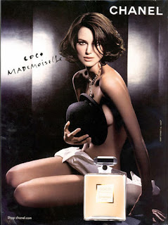
as the audience are influenced to create a false image of themselves. This is called interpellation. An example of this is shown below.


Magazine advertisement first draft

Below is a print screen for our first draft of our magazine advertisement for our digipack. After looking at it again, we have discovered some elements need changing or rearranging. The list of changes needed are shown next to the printscreen.

- Institutional logo needs to be placed at the bottom of the ad
vertisement.
- Add in release date and price so the audience known when and how much the product is available.
- Decide which information needs to be seen first, what is most important and will attract the target audience.
- Add the 'VR' logo to the cover, making it link back to the other texts.
- Keep to the house style created through the other texts.


Magazine Advertisement Second Draft
Below is a print screen of our second draft of the magazine advertisement. After revising the targets we set ourself from the first draft, we produced the following image as our second draft. However, we have since discovered more aspects which we want to change to improve it. They are shown below the image of our second draft:


- Change the colour and font of the boxes at the bottom, so that they link to the other texts
- Change the central image of the digipack cover as it is blurred slightly
- Remove the " marks from around the title of the single
- Add the price so that the audience know how much they can buy it for

Magazine Advertisement Third Draft
Below is a screen shot of the third draft of our magazine advertisement. I used the comments on elements which needed improving from the second draft and applied them to this draft. We added a price to the advertisement so that the target audience can see straight away how much the product costs. We also changed the colour of the posters so that they link to the digipack cover, showing a clear housestyle throughout.


Sunday, 19 September 2010

Digipak

Final Front and Back Digipack Cover
Below is the final design of our front and back cover of the digipack. We have taken all of the feedback from the drafts to create this as our final cover. Below the front and back covers shows the final design for the inside covers too. After that, the process we took in research and planning in to the ideas and drafts of the covers are shown.

Final Inside Digipack Cover


Inside Disc Two Cover


This post has been created to show our research in to CD/DVD digipacks of our genre. We have also researched institutions and artists from within our genre. This post also shows our planning and draftings for our own covers. All of this is shown below.

To belong to three of the top music institutions. The music artists that we have listed below belonging to the three institutions and a part of the music genre pop rock we are he purpose of this research is find established music artists within the music industry who creating for our music band. By researching these three institutions we can see what institutions are successful within our music genre and use them as a part of our cd/dvd digipak.

Institutions - We have researched the top two institutions in the world and identified which pop-rock acts are owned by these institutions. We have then chosen an institution to represent our band based on the data we have collected.

Sony Sony is the second largest recording label in the world. It was founded in America but holds many acts from around the globe. There are many acts on the record label which fall under our pop-rock genre. These include: * The Fray * Chris Daughtry * John Mayer * Kelly Clarkson * Kings Of Leon * Madonna * Pink * Scouting For Girls * The Script

Universal Music Group Universal is the largest record label in the world. It is owned by the media conglomerate Vivendi which is based in France. The Universal Music Group also own many acts which fall under the pop-rock genre: * The All-American Rejects * Avril Lavigne * ABBA * Ashlee Simpson * Chris Daughtry * Coldplay * James Morrison * One Republic * Rihanna * Bon Jovi * Jack Johnson * James Blunt * John Mayer * Lady GaGa

We have chosen the institution Universal Music Group to represent our band. From the list above, it shows many pop-rock - the genre of our band - artists that are owned by this institution. The acts range from old to new and lessknown to well known. It also has a mixture of acts from around the globe.

Our band name 'Vintage Rocks' links to the old bands, showing there have been many pop-rock acts before, but it is ironic that our band is new and has incorperated conventions which suit the need of our target audience. These conventions are not typical of every pop-rock act - having a mixed gender b

and, who can all play their own instruments. This is the logo we will use to show institution on our digipak.


Textual Analysis of digipack covers
We looked at different digipack covers for artists in our genre and analysed the connotations. We did this to help us gain an understanding of what to include for our own digipack covers. Below there are examples for different digipacks in our genre.

Madonna Digipak Analysis This is the front and back covers for Madonnas latest digipak cover. Below is the written analysis of typical conventions for digipaks.


- The image on the back cover of the disco ball implies the disco genre of the digipak and her 'Confessions Tour'.

- Madonna's facial expression also links to the title: 'confessions'.

- There is a separation between the DVD features and the track lists

- The institution information is at the bottom of the page as it is considered least important to the target audience.

- Key information is all within the top third of the page

- There is also a parental advisory sticker showing the age restriction upon it.


- The colour scheme is consistant on both the back and front covers


- The DVD list is longer than the track list, causing the audience to believe they are getting more for their money than if they were to buy the original CD.


Snow Patrol Digipak Analysis


This is the covers for the snow patrol digipack. The typical conventions have been picked out and written on the covers. There are connotations for the front and back covers, the inside booklet and the CDs themselves.


Lady GaGa Digipack Analysis Front Cover - The black background could suggest she is hiding away from something, most likely the paparazzi - Limited edition advert on the left hand side strip on the digipak, suggestingyou can only access these songs and footage when you purchase her digipak.

- Red typography is used against the black, grey and blue image, which makes the lettering stand out more and create more awareness for her. - Her name appears in baby blue lettering against a black background which definitely has the same intention as the limited edition strip, to create the awareness for the audiences to spot ' LADY GaGa'. - The title of the digipak for her album appears in a small typography style in the shades of the artists, this could indicate the importantance of the image of the artist to the title. - The size of the image of Lady GaGa is positioned centre and various areas appear bright to catch the eye of the audience, with the black background behind the artists. The positioning of the image suggests she wants to be the main centre of attention in the music industry and people to follow her unique style.

Back cover -The costumes including the 'wacky and outrageous' make up Lady GaGa has on, in her photographs such she is a very lively and flamboyant performer.

- The traditional institutional information in the bottom third, positioned on the left hand side alongside the barcode for the digipak. - ' BONUS TRACKS', it notifies the audience especially her fans that these tracks will only appear on this digipak and the only way to hear is to purchase this digipak she has available to buy. - The background is still black, with the baby blue lettering on top. Although the limelight is surrounding Lady GaGa is created with this light shine effect to show the star and fame, she has turned herself into.

1st Inside Cover - A unusual photograph of Lady GaGa which would not be shown anywhere else other than the inside cover of the digipak. This breaks the usual conventions for the representation of Lady GaGa, because always seems to be confidently posed with costume and make up. Although this photograph shows a different side to her personality although she is still pulling a small hand action which expresses the performer in her personality. -Constant use of silver, white and black which shows various signs about her as a individual person deep down. Also the constrast between them could show the spontaneous side to her lifestyle/fame. - The positioning and framing of Lady GaGa in the photograph encourages the audiences to look at her hand actions and what reaction is she trying to entice from this action/pose. - The mise-en-scene allows the audience to see the wealthy and successful lifestyle she has earnt for herself. This could show how established she is in the industry and how she can use settings like that for her digipak photographs. - The sparkly background for the CD holders mirroring the part of her unique personality which is focused on their glamour. Glamour is very key to the appearance which include the ways she presents herself withmake up and costume, to the way she performs to audiences.

- Lady GaGa's Symbol appears on the two CD's, which also appears the majority of her videos to show the audience that this is her signature sign/symbol. This is for the audience so if they notice the lightning bolt symbol wherever, they will associate immediately to Lady GaGa's. This is the reaction that Lady GaGa was hoping for, this sign appears in a sparkly glittery style which complimented the white background.

The Script Digipak analysis
Front cover: The bands title appears in the top third of the frame and is the largest/boldest font on the cover - so you know that it is important and that it is meant to stand out. The background is pale blue to represent a sky line, with images of chimney tops in the foreground - represent a rural area or the bands hometown, which could be known for its tall/multiple chimneys. Appearing through and above the roof tops is a human hand holding a man and woman in formal wear dancing - this could represent them-the band, wanting to come out on top? they want to do well, but need a helping hand? Just under the title reads: in small font 'includes the hit single - the man who can't be moved'. They may have decided to include this on the front cover because that song has already done well, and is now well-known and popular? and so people will want to buy the whole album? Underneath this reads: 'insert this CD into your computer and discover exclusive and video content'. They might have chosen to feature this on the front cover as it is a unique selling point - if you buy the CD you are also getting extras.

Inside cover/back of booklet:
On the inside cover/back of booklet is an image if the band - medium show of them sitting on what appears to be a roof top - again, this could also be used to represent where the band are from. The main singer is sitting in the middle of the other two band members but he is not completely centered within the frame - this tells us who the main band member is. None of them are looking into the camera but all look as if they are in their 'own little world'. This gives the impression that they were trying to achieve a natural, non posed shot. They may also have wanted to portray through the image that they are just regular men, who lots of people are able to relate to? CD: The CD is very plain and simple - the back ground is black and the top half contains the band's name in a large white font. The company/bands institutional information is placed in a curve around the edge, following the shape of the disc.

Back cover: The back cover contains the bands name (as before) in the top half of the frame. Underneath, in smaller lettering is the track list, plus bonus track. The bottom section contains the band and company's institutional information and company logos, and the barcode.


Paramore CD/DVD analysis
The front cover of this CD/DVD contains black and white images of each individual member.
They have each been photographed in action - playing their own instruments. This may have been done to show the audience the different roles within the band, e.g. singer, guitarist.. The bands name is placed in the top section of the front cover and has the largest font, it is the only object in colour on the front cover and so we know that this piece of information/title is supposed to stand out against everything else. The colour of the bands name is red which could represent anger and viloence - this is a stereotype of a rock band? The colour red can also represent love and romance, which could represent the 'pop' side of the band. The album name is placed under the images of the band at the bottom, and is a smaller font size - it is of less importance. The bands name is as before, and placed on the spine of the album. Their name is the most important thing - their audience will instantly be able to recognise the band by their name. The back cover includes the bands name again - as before, in the top section of the back cover - placed at the top because it is the most important. Below the bands name is a balck and white image of all four band members, except the female member is shown in colour. This shows her importance within in the band, and that she has the'lead role'. She is the dominant character of the group - this breaks the rules of the stereotype that men are the more dominant person. They are going against this stereotype and portraying the only female within the band of four, to be the one with the power. The band members body language portrays the band as being quite 'tough'. This supports the stereotope of the 'rocker' image. They are sitting on stairs in an urban/built up area - this could represent where they came from? -They are just like everyone else. The track list is shown below this image in red - to link to the bands name and theme.

-------------------------------------------------------------------------------------------------

Digipak First Draft Mock-Ups

These mock ups for the digipack have the same importantance as the magazine advertisement mock ups as the digipack mock ups allow us a group to analyse the contents and see where, why and how we have addressed the codes and conventions. Also comparing to various established and successful digipacks from previous audience research, we can compare as a group to see what we are missing out and what will benefit the digipack by including them. Also taking into consideration the design, content and structure of the three drafts, as a group we will combine various different aspects, keeping in my mind the four key concepts and conventions. All the decisions we make are to benefit our audience as we want them to be attracted to it and buy it.
This image to the left is one of the three designs for our music band 'Vintage Rocks'. On the left of the image shows the front cover which inclues the title of the band appearing in two contrasting lettering fonts and varied sizes. This is to fit in with the meaning behind the words, for instance 'Vintage' is appearing in a old style/ellegent style lettering. Whereas the 'ROCKS' is presented in a bold and rigid block lettering which coinsides with the rock aspect of the genre, we are targeting extremely well. The positioning of the band
members is crutial in order to give the impression to the audience that Amie is the lone female in the group and the singer, focussing the main attention on her. Although the aim is to keep the other two male band members in the frame because as a group we are not trying to soley focus on Amie, we are trying to show some dynamics to the group with two males and female lead singer. The back cover includes two sections which include cd track listing with various bonus tracks
which will be advertised on the promotional features sticker, which we will include on the final draft. On the other side includes the DVD part to the digipack which involves the unseen footage, live performances, music videos, interviews and much more content as well. The institutional information incorporating the inistitution's logo is visable at the bottom of the digipack back cover alongside the barcode which is included for the product to be purchased. This design was based upon the research that Madonna and Lady GaGa had the layout of split CD and DVD sides to the back cover and a special slot for the bonus tracks and features to appear in. The next page below the front and back cover presents the back of the inside booklet and disc one which is the CD section of the 'Vintage Rocks' digipack. Performing the drums in 'Vintage Rocks' is Stuart and one of the band members instruments was included to show they can all play an instrument and especially the drums they hold a sense of identity with the 'VR' on the front of the foot/pedal drum. The band name is positioned above and below the instrumental picture and this is to focus on the image and the meaning behind the particular instrument photographed. The words both show the same style and meaning towards them although the do not appear in the same lettering font to the front cover. This is soley down to the prevention of repeating the same style and font over and over again and trying a new font but incorporating the same style to it. Both Cd's show the same design with a white CD with name of the digipak and the institutional information in two different sections either side of the centre hole of the CD. The image beside DVD disk shows Amie the lead singer carrying a guitar through a corn field, symbolise the love and enjoyment she gets from performing music outdoors. The dragging of the guitar could symbolise the freedom of the band and the music the produce. The choice of location was down to the previous research from artists in our genre who were successful with albums featuring a corn field. Also with a local corn field near by and access to a guitar it was a strong possible to photograph this particular scene. 'The Script', who featured in our previous research included a corn field photograph with all the band members looking up in a high angle camera shot view.
----------------------------------------------------------------------------------------------------------------
The images above and to the left show photographs of another digipak draft for 'Vintage Rocks.' We have labeled the connotations as to why we have decided to make the decisions we did.


-----------------------------------------------------------------------------------------------------------------
LAUREN - digipak mock-up Back and frontcover

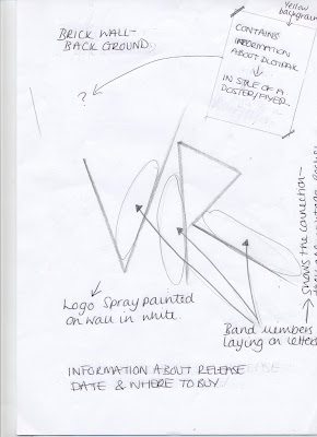
Front cover: Vintage Rocks' logo features in the centre of the frame in large white font against a brick wall - this is to enhance the most important feature on the front cover. Having the logo so big in the centre immediatly tells people that this is the bands name/logo. This may also mean that the bands logo will become well known, so their target audience will recognise them just from this. There is a poster/ad stuck to the wall which contains information about the album, including bonus features - I have chosen to include this on the front cover to draw the audience in, as one of the main features of our digipak is that if you purcahse it you will also gain extras. Underneath the logo is the bands institutional information. This is shown in smaller font so that the main focus is still on the most important information which we will use to draw the audience in. The image of the band is a kind of 'street style' and 'ordinary', and i have reflected this within the front cover by making the bands logo, information and features of the digipak all feature on a brick wall. This also links to some of the bands promotional photos, as we shot some of our photos against a brick wall.

Back cover: The back cover lists all the features of the digipak including all of the features the audience can recieve if they purchase the item. I have split the back cover into three individual sections to make the information it consists easier and clearer to read. Doing this has also split the information fairly so as it doesn't look to be too much information at one point:- the left-hand section contains information about the CD -e.g. the track list. Beside this the right-hand section contains information about the DVD and the bottom part contains the 'bonus features list'.

Inside cover and disc


Inside cover: The back cover of the booklet consists of a plain black background, and a microphone + stand with a spotlight- this image represents a performance which links to the band and the features included with the digipak. The bands logo is repeated again as before so to connect the band to the image. The silohuette of the microphone is standing over the bands logo -this is to represent the main singer (Amie) of whom the band revolves around - she is the band member whom of which has the most power, and so she towers over the bands logo.


Disc: The disc is just plain black and features the bands logo in white as before. The track list is shown around the rim of the CD, and the bands institutional information is shown under the logo. The logo is the boldest feature with on the disc, so to show the most important piece iof information stand out. Each of the colours on the digipak link to the genre of the band: pop/rock. The black and grey represent the rock image of the band, whereas, red and white links to pop genre. From looking at 'Paramore's overall image, i have discovered that they repeat the same colours through their clothing and murchandise, and this is what I have chosen to do through out the digipak design.


ELLA - Digipak Mock-up


This one of our first drafts for our digipak cover, I did this so it is easier when it comes to creating our final product. We all created dratfs and included as many codes and conventions as possible so we can put them all together when creating the final one. The influence of the front cover was from 'The Script' as their promotopnal shots were also in a cornfield. The key information is also within the top third as this is a key convention within digipak covers. The blurb containing the DVD listings is bigger and longer incomparison to the music track list as this causes the audience to believe they are getting more for their money. The institutional information is placed at the bottom of the page and on the spine of the cover as this is considered least important for our target audience. The main focus is on amie, our lead singer as this links to the theory of 'sex appeal'. I also did this as Paramore have done in their promotional shots and some covers and they are our buggest influence:


The back cover continued with the same housestyle so it is not confusing for our audience. It will contain the same colours, fonts and picture in order to link them and include the codes and conventions. The image has slightly changed as she is not facing foward anymore and is now facing backwards. This indicated the end of the CD and the fact she is finished and leaving. The main focus is still on her though, to continue the sex appeal. Amie's clothing is of a short red dress in order to keep to the genre specific colouring - linking to the Rock side of our genre but also seductive to link to the 'sex appeal' theory.

The influence of my CDs were Madonna as we had not finalised our logo yet, I used a guitar and a microphone to imply our genre of music. Our audience research also said that they would like to see the band with instruments so I did this on the cover and included the instruments on the CDs. The institutional information and logo is also placed on the CDs for brand recognission reasons.

-----------------------------------------------------------------------------------------------------------------

Final Drawn Draft of CD/DVD Digipack Below is the final draft of the drawn digipack. We have annotated the connotations, explain what is what on each of the covers. ----------------------------------------------------------------------------------------------------------------


First digipack drafts
Below is a screen shot of the first draft for our digipack cover. From the photograph, it can be seen that we are using the software Illustrator to create the covers. After creating the first draft, we discovered certain elements of our cover needed to be changed. These are shown below: - Making sure colour matches for both front and back covers, to establish house style - Move the bonus content sticker to a different place, as it effects the look of the main image - Move the band website to the bottom of the back cover, as this is where they typically are - Add the MTV quotation and star rating to the back cover with the blurb - Consider the spacing around each element on the cover


Second draft of digipack cover After following the targets we set ourself from the first draft, we have come up with the second digipack draft. This is shown as a screen shot below:

Again we created targets for ourself based on peer feedback. These were as follows: - Consider framing very carefully - move the band website so that it is not touching the institutional logo - Make the photographs of the band stand out from the background - put a boarder around them - Change the name of the bands lead single, as we have changed this in our music video - Help to show a clear house style from the front cover and the back


Third Digipack Cover
Below shows the third design of our digipack cover. We have used the elements which needed to be improved upon from oursecond draft to ensure that this draft meets all of the requirements. We have closely considered the framing within the cover, and made sure all of the key conventions are included in this draft.


Inside Digipack Covers First Draft


This is the inside cover first draft which includes a photograph of Amie who is the lead singer of the band. Firstly we wanted to promote the only female in the band and the fact she is the lead singer. Although we felt as a group we needed to show a group photograph which showed a different side to bands identity. To link with the codes and coventions of pop rock bands we have to show a particular type of photograph to fit


in with style of the band we have created.

Inside Cover - Second Draft

The second screenshot shows the second draft of the inside digipack covers after carefully consideration to other established bands in our genre, we felt that this picture showed a side to the band that the audience would like to see which is that they are all close as band members. The inside covers keep to the grey, black and yellow theme as this links in with the other media such as the magazine cover and the front and back covers of the digipack.

Back of Inside CD Cover

This is blank cover of the inside cover as this would appear on the back of the first disk, which from researching other bands in our genre's digipack, some haven't and some have used this deisgn. By researching established artists and bands in our genre, we found out they did not use this space to show another photograph and we decided to balance between the photographs and space. This would be where the DVD extras disc would be placed.